
Positivity Project - Master List
SUMMER 2016
- WEEK ONE (06/20/2016 - 06/25/2016) Deconstruction
- WEEK TWO (06/26/2016 - 07/02/2016) Know Thyself
- WEEK THREE (07/03/2016 - 07/09/2016) Tale Of Two Inspos
- WEEK FOUR (07/10/2016) To Plan Or Not To Plan
- WEEK FIVE (07/17/2016 - 07/23/2016) Spirituality As Normal Life-Stuff
- WEEK SIX (07/24/2016 - 07/30/2016) Summer Blues
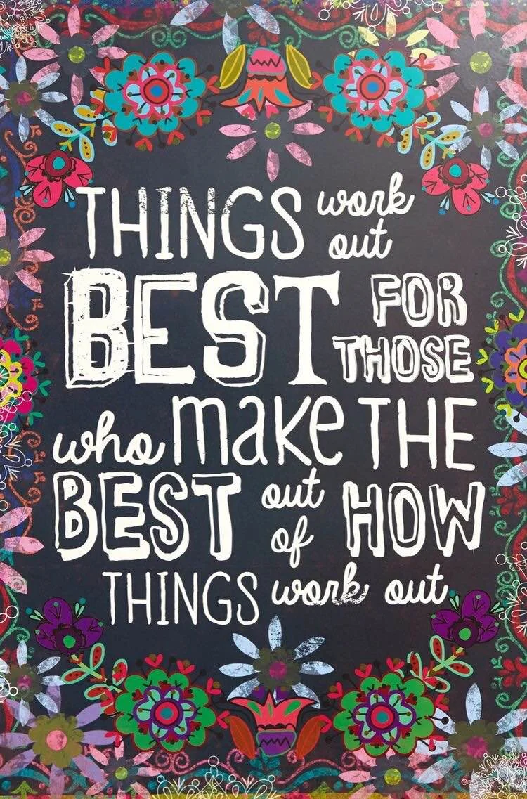
WEEK 7 (07/31/2016 - 08/06/2016) SEE ALL THE COLORS; BELIEVE THINGS WORK OUT
What, at once, looks like a time of despair can ultimately be a time of great change and growth and renewal. See more for aaaallll the pictures...
SUMMER 2016
- WEEK ONE (06/20/2016 - 06/25/2016) Deconstruction
- WEEK TWO (06/26/2016 - 07/02/2016) Know Thyself
- WEEK THREE (07/03/2016 - 07/09/2016) Tale Of Two Inspos
- WEEK FOUR (07/10/2016) To Plan Or Not To Plan
- WEEK FIVE (07/17/2016 - 07/23/2016) Spirituality As Normal Life-Stuff
- WEEK SIX (07/24/2016 - 07/30/2016) Summer Blues
Week 7 (07/31/2016 - 08/06/2016) See All The Colors; Believe Things Work Out
What, at once, looks like a time of despair can ultimately be a time of great change and growth and renewal.
WEEK NINE (08/14/2016 - 08/20/2016 Into Action

WEEK TEN (08/21/2016 - 08/27/2016) Rest And Restore

WEEK THIRTEEN (09/11/2016 - 09/17/2016)

WEEK FOURTEEN (09/18/2016 - 09/21/2016)

WEEK EIGHT (08/07/2016 - 08/13/2016) Energy Is Everything


WEEK ELEVEN (08/28/2016 - 09/03/2016)

WEEK TWELVE (09/04/2016 - 09/10/2016)


KEEP GOING
x/Amy
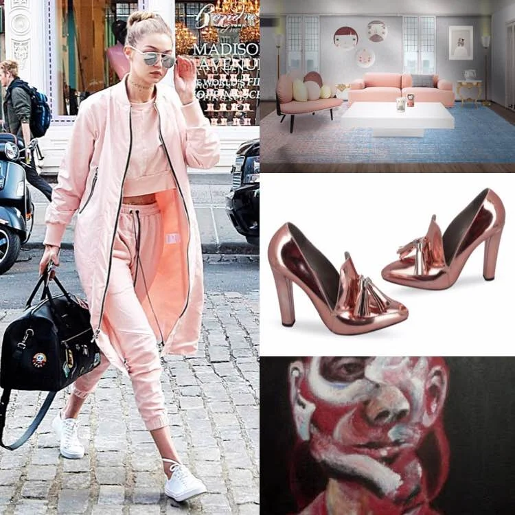
Inspiration Board: Spring 2016 Rose Quartz
Use the color as an accent before you go full on. Try a small piece of costume jewelry or a vase in a tone you've avoided - if it feels good - and go from there. Finding outside things you admire in these colors is also a great way to start, try a pinterest board!
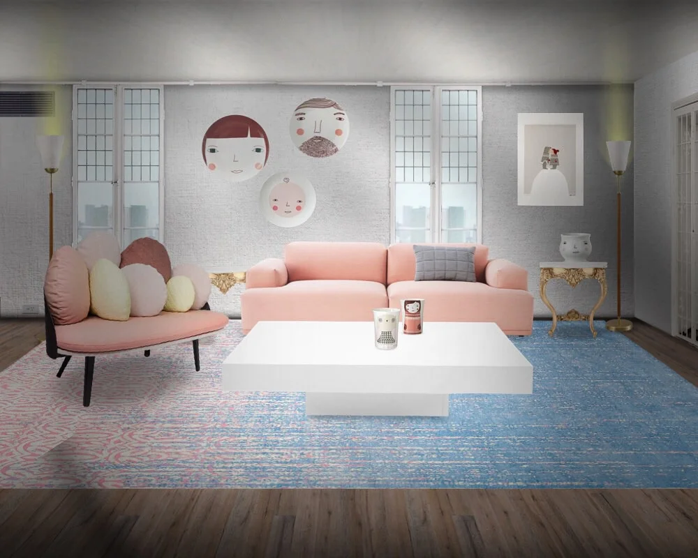
INSPIRATION BOARD:
💕 I created a quirky, contemporary living room using Donna Wilson's art, minimalism, ease, and comfort as my focus. 💕
💕 Alexander Wang's metallic Anais loafers 💕
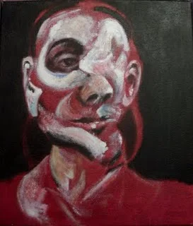
💕 The art of Francis Bacon 💕
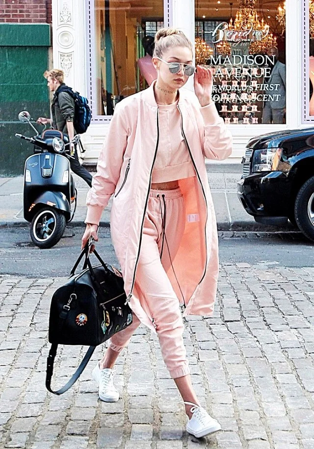

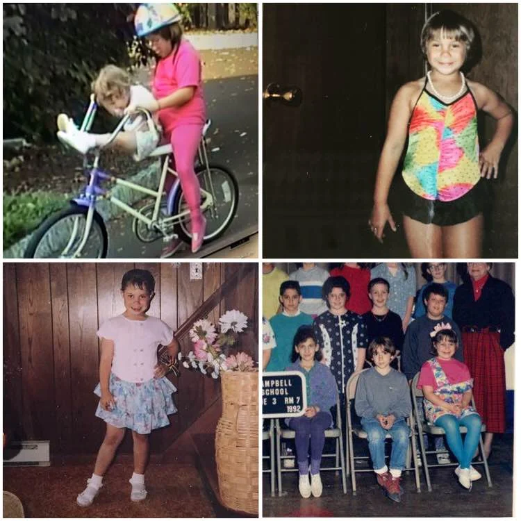
BONUS: Check out the eccentric display of my childhood commitment to the color pink BELOW! It's no longer embarrassing, mostly just bold AF and I admire that.
As you can see, the transition from my youthful flagrance to adult inspiration happens only over time and with experience and refinement.
As we are exposed to more things we develop more intricacies into our tastes.
However, I would still rock 50% of the below ensembles. Socks and sandals while blending into the home decor - now that's impressive! haha
All the love. x/Amy
COLOR TIP:
Using a color you've lost your taste for in new and inspiring ways is an excited challenge. I began loathing pink after a childhood full of BRIGHT fuchsia leggings and puffy coats and generally being teased for my interpreted lack of fashion sense. However, that was a LONG time ago. These days, I love different materials and tones and integrating a classic pink into metallics or interwoven with deeper burgundy has brought new life to a color I was almost certainly done with.
Use the color as an accent before you go full on. Try a small piece of costume jewelry or a vase in a tone you've avoided - if it feels good - and go from there. Finding outside things you admire in these colors is also a great way to start, try a pinterest board!
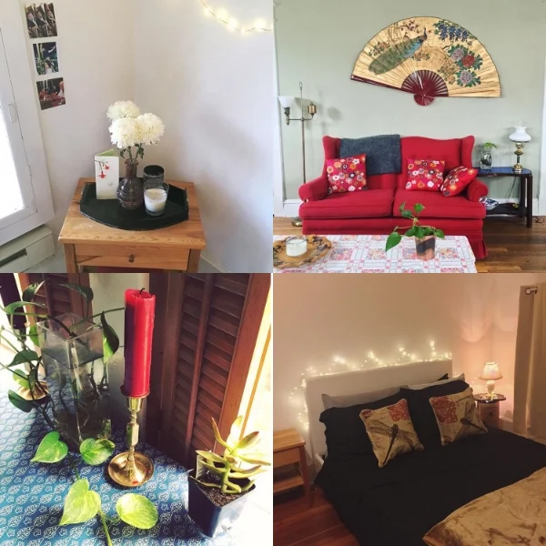
Colorstory: Red as an Earth tone
I LIVE IN AN OLD BUNGALOW THAT LENDS ITSELF TO MORE EARTHY DECOR. I'VE EMBRACED IT, WHILE ADDING AS MUCH OF MY COSMO-MINIMALIST FLARE AS I CAN (IN A HOUSE OF 3 ROOMMATES). ABOVE YOU'LL SEE HOW RED HAS INCORPORATED ITSELF, ALMOST UNINTENTIONALLY, IN VARIOUS CORNERS.
I live in an old bungalow that lends itself to more earthy decor. I've embraced it, while adding as much of my cosmo-minimalist flare as I can (in a house of 3 roommates). Above you'll see how red has incorporated itself, almost unintentionally, in various corners.
TOP LEFT: My bedroom relationship corner where I have a kiehl's bold red gift box just out of frame full of relationship mementos along with the red flowers in a Name's Day card my boyfriend gave me. I tied the red into the pink of the vase and the white of the walls and flowers.
TOP RIGHT: My roommate and former roommate have contributed all of the pieces in this space of our living room. How do you make a red, blue, green, and wood palette work? It's not something I would pick out but it's incredible to see how intentional we've made it look. The threads of color are through all the pieces and the red couch sort of blends in rather than dominates the space.
BOTTOM LEFT: Gold! Gold and Green have been a good thread to carry with the red accents and really modernizes a house full of old wood. While you do risk the Christmas vibe, I think we land more on old world European.
BOTTOM RIGHT: My bedroom's winter motif. I bought new bedding to make use of my room's given warm or yellow overtone which makes this look seamless. If you're renting, it's easier to work with what you've got. The soft lighting of a rainbow bulb and twinkle lights add incredible warmth to the cozy space.
I played with both warmer and cooler versions of this palette. The paint, lighting, and natural structure of the house informed those choices. I used red cohesively rather than divisively through intentional placement, avoiding singular over-saturation.
I want to encourage you to not be afraid of red, it's more utilitarian than you think and is never boring. However, despite it's boldness, this serves as a reminder that red can be used tastefully and feel integrated rather than claiming too much of the space.
Do you use RED in your home design? I'd love to read how and see pictures. Tag your pics on Instagram with #NMRed and I'll update this post with credited submissions - Shared style is the best style.
x/Amy